Cracking the Code of Complexity: A UX Redesign of MIT Libraries Website
Ed Tech
Cracking the Code of Complexity: A UX Redesign of MIT Libraries Website
Ed Tech
At the Heart of Research
Project Overview
As a cornerstone of one of the world’s top research institutions, the MIT Libraries Website serves a vast and diverse audience, students, faculty, and scholars from every discipline. It’s more than a place to borrow books; it’s a digital ecosystem of tools, services, and collections designed to support knowledge creation and discovery.
But even the best content can fall short if users can’t easily find what they need.
Made For
MIT Libraries
Team
4 Product Designers
My Responsibilities
Research Planning, Usability Testing,
Client Management & UX Design
Timeline
5 Months
Lost In The Stacks
The Problem
Despite its wealth of resources, the MIT Libraries website overwhelmed users with a cluttered homepage and confusing navigation. Essential tools like research guides, citation help, and library hours, were hard to find.
"I just Google it"
Despite its wealth of resources, the MIT Libraries website overwhelmed users with a cluttered homepage and confusing navigation. Essential tools like research guides, citation help, and library hours, were hard to find.
"I just Google it"
Despite its wealth of resources, the MIT Libraries website overwhelmed users with a cluttered homepage and confusing navigation. Essential tools like research guides, citation help, and library hours, were hard to find.
"I just Google it"
Drag ⟷ to reveal
A sneak- peak into the final solution
Reframing the Challenge
Core Questions


Understand, Explore, then Materialize
The Process

o
Uncovering the Truth
Stage 1: Understand
To uncover the real challenges users face on library websites, we combined research, testing, and conversations to map their journey and pain points.
Literature Review
Literature Review
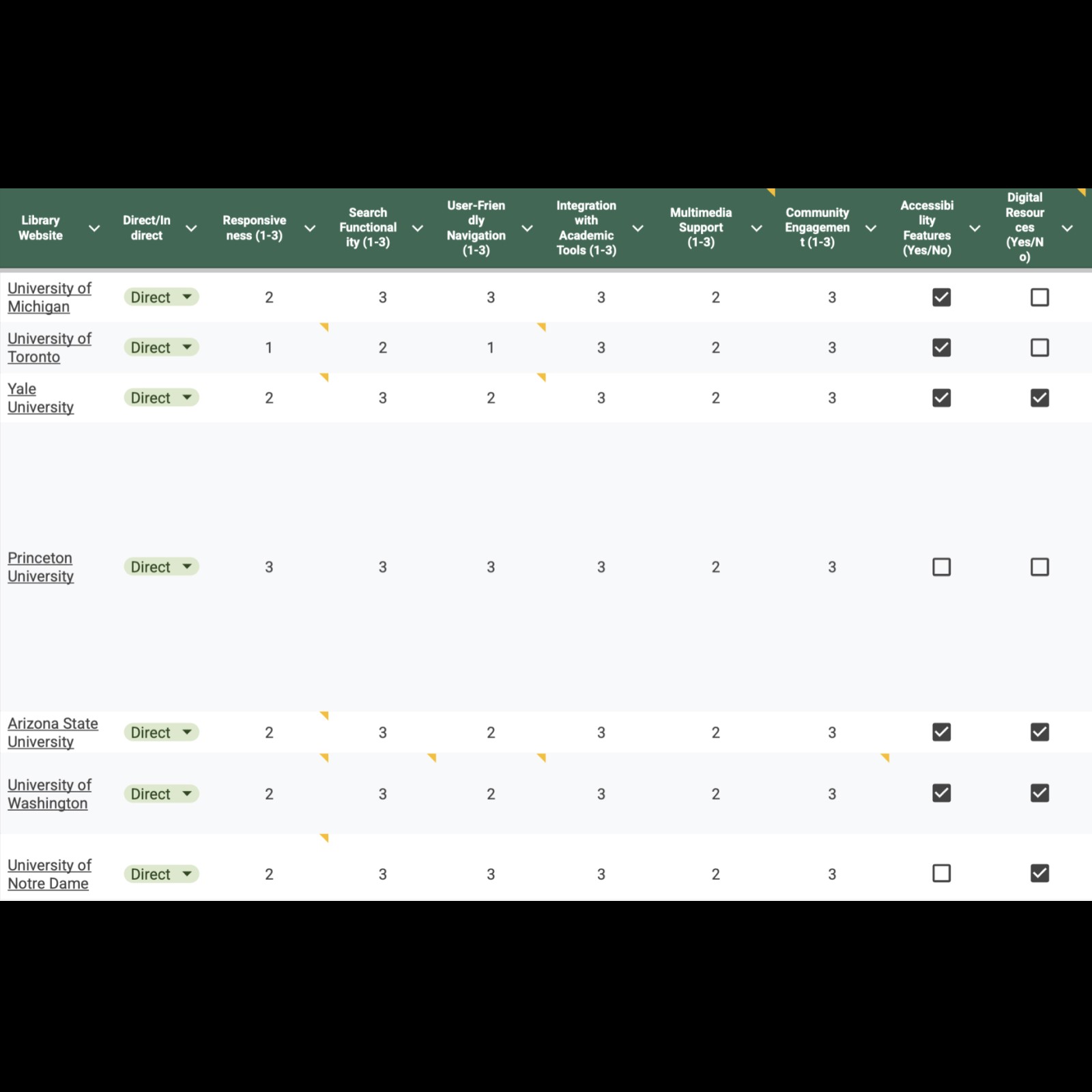
Competitive Analysis
Competitive Analysis
Stakeholder Interviews
Stakeholder Interviews
Card Sorting+ Tree Testing
Card Sorting+ Tree Testing
Usability Testing
Usability Testing
We explored 15+ academic sources to uncover recurring issues in library UX:
Users face information overload
Many lack library literacy
There's a growing demand for stronger scholarly support
Decoding User Confusion
Key Insights

"Sometimes this (navigation bar) can feel like they're looking for a needle in a haystack."
-Liason
"Sometimes this (navigation bar) can feel like they're looking for a needle in a haystack."
-Liason
Bringing Ideas to Life
Stage 2: Explore
Rethinking the Framework: Information Architecture
.

Current IA
Based on the rsearch insights and test results, we designed and tested two new IA models to align with how users actually think:
Topical IA:
|86% task success rate, which was
|17% increase from the original IA.
These findings suggest an IA approach more aligned with user expectations and mental models.
Topical IA:
|86% task success rate, which was
|17% increase from the original IA.
These findings suggest an IA approach more aligned with user expectations and mental models.

Topic-Based Redesign of the Library’s Information Architecture
Task-Based IA:
|78% task success, which was
|13% more than the current IA.
Findings indicate that this approach was better for direct goals than the current IA, but users were unfamiliar with using a navigation bar based on tasks.
Task-Based IA:
Resulted in a
78% task success, which was 13% more than the current IA. Findings indicate that this approach was better for direct goals than the current IA, but users were unfamiliar with using a navigation bar based on tasks.

Topic-Based Redesign of the Library’s Information Architecture
Reimagining Search:
Simplifying Discovery Through Clearer Paths
Across all four homepage variations, one of our core priorities was addressing user confusion around the search experience, specifically the overlap and lack of clarity between Bento, Primo, and the site-wide search.
Our research revealed that search was often a default fallback when users felt lost, yet it consistently caused confusion due to unfamiliar labels and unclear distinctions between search tools.
Option-1
Option-2
Option-3
Option-4
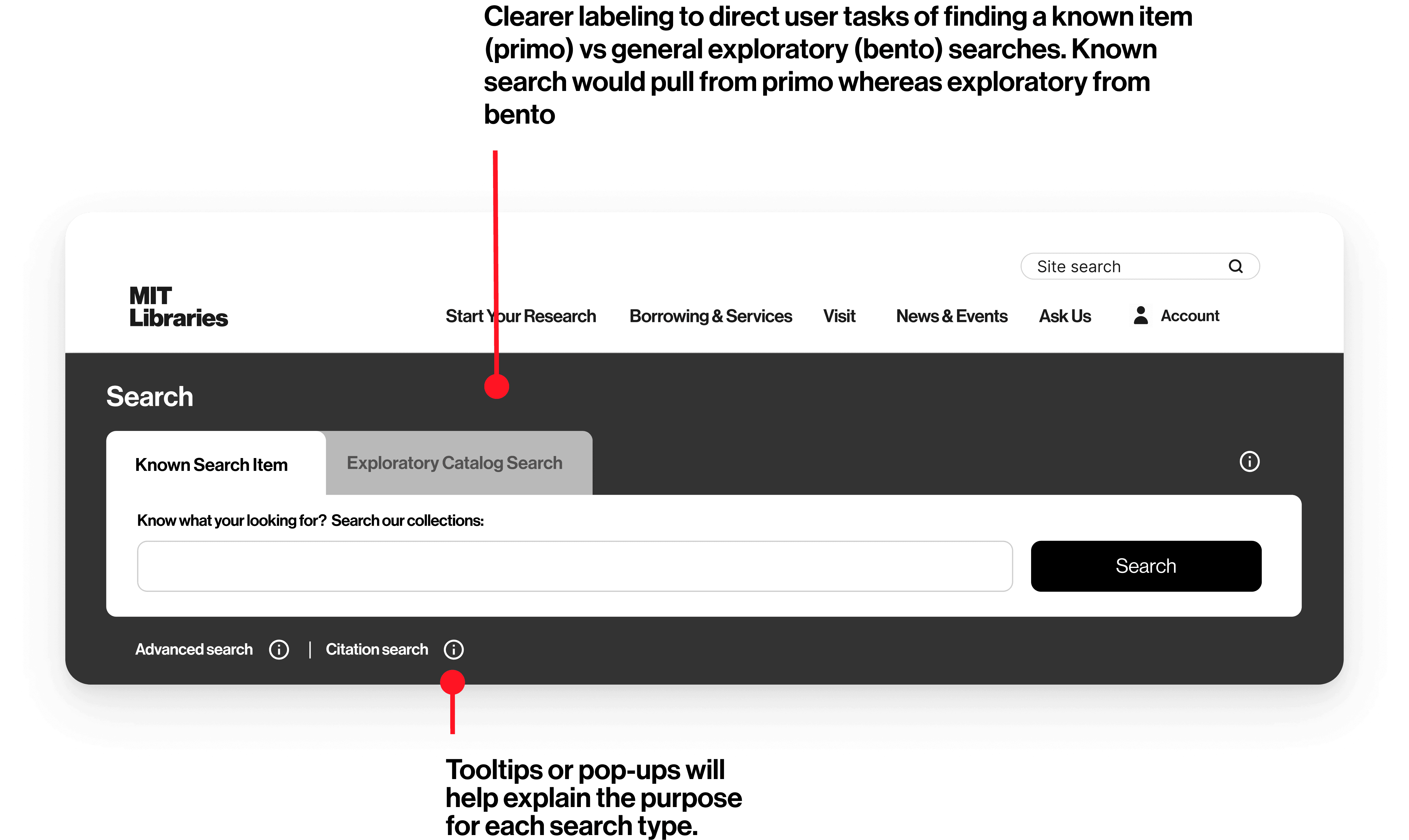
Introduced tabbed search functions labeled as Known Item Search and Exploratory Catalog Search a direct response to user behavior and interview insights.
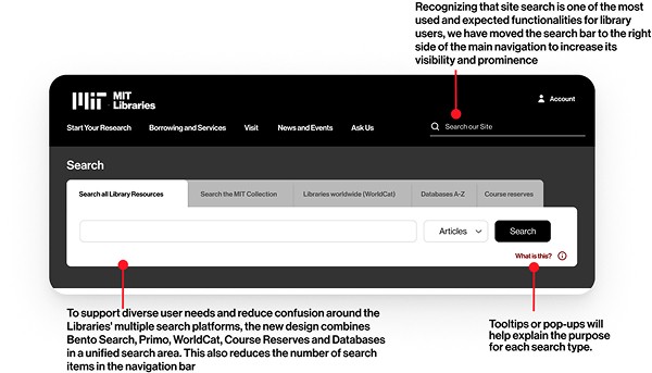
Moved the site search into the navigation bar, where users naturally expected it. We also used tooltips and popups to explain each search type.

Maintained tabs but added archive/manuscript options, reflecting the structure of the Bento search and improving content categorization.

Introduced a dual dropdown menu allowing users to select both material format and source a direct response to liaison feedback
Option-1
Option-2
Option-3
Option-4
Introduced tabbed search functions labeled as Known Item Search and Exploratory Catalog Search a direct response to user behavior and interview insights.
Moved the site search into the navigation bar, where users naturally expected it. We also used tooltips and popups to explain each search type.
Maintained tabs but added archive/manuscript options, reflecting the structure of the Bento search and improving content categorization.
Introduced a dual dropdown menu allowing users to select both material format and source a direct response to liaison feedback
View it on a bigger screen
Designing the Gateway: Homepage Redesigns
View it on a bigger screen
Option-1
Option-2
Option-3
Option-4

Dual search, contact tools, and visible research guides

Centralized services (citation tools, thesis prep), expert filters

Interactive carousel, smart filters, and minimal event content

Treat the library as a resource hub task pathways
Option-1
Option-2
Option-3
Option-4
Dual search, contact tools, and visible research guides
Centralized services (citation tools, thesis prep), expert filters
Interactive carousel, smart filters, and minimal event content
Treat the library as a resource hub task pathways
A vattt
From Insights to Impact
The Final Outcome
Higher navigation clarity
Task success improved by up to 10%, with noticeably fewer “dead ends” and backtracking.
Increased user confidence in search
Understanding of search tools (Bento vs. Primo vs. site search) improved by up to 24%.
Clearer homepage layouts
Users could immediately identify where to begin, reducing hesitation and cognitive load.
Better alignment between teams
The redesign provided a shared language and structure for designers, librarians, content strategists, and leadership — something the MIT team highlighted as an unexpected but important outcome.
Clarity
A navigation and homepage that communicate exactly what the Libraries offer — without jargon or guesswork.
Exploration
Predictable paths that help users find research tools, services, and experts with confidence.
Trust
Content structures and labels that feel reliable, transparent, and aligned with how people naturally search for academic support.
Our final presentation to the MIT Libraries team was met with a lot of enthusiasm.
They appreciated the breadth of our explorations and the clear reasoning behind each design.
They were especially excited about:
the multiple search strategies we proposed,
how we restructured research support,
and how our IA could serve as the foundation for a multi-year redesign roadmap.
The team is now preparing to bring these designs into stakeholder discussions and preparing for development stage.
Simplification is key
Users value a quick and easy process, especially on mobile.
Iterative testing pays off
Regular testing uncovered hidden issues and ensured the design met user needs.
Details matter
Small improvements, like error validation and mobile optimization, had a significant impact.

Final meeting with Naks-Yetu team
“You’ve given us components, tactics, strategies, and options, not just designs. This is invaluable for an organization like ours.”
“You’ve given us components, tactics, strategies, and options, not just designs. This is invaluable for an organization like ours.”
“You’ve given us components, tactics, strategies, and options, not just designs. This is invaluable for an organization like ours.”
Behind The Scenes
What you didn't see
Click to zoom in