
Project Overview
In March 2025, the Naks Yetu team approached the Center for Digital Experiences with an open-ended challenge:
“We know our site isn’t quite working, help us make it better.”
Naks Yetu is a vibrant, community-powered platform that connects residents and travelers in Nakuru, Kenya, through local events, stories, and shared experiences. Our mission was to improve the platform’s usability while honoring its storytelling spirit.
Drag ⟷ to reveal
What I specifically owned
Usability Testing, initiated the complete redesign, tre
The challenge
No specific design requirements were given, just a directive to improve the experience.
The website was still under development; not all pages were available.
We had a 7-week project timeline from kickoff to delivery.
Our goal was to present actionable research and redesign recommendations.
Framing the core questions
From the internal team heuristic evaluation we gathered initial insights and then moved to frame the core questions, which shaped the entire redesign.
1.
Can first time users understand what Naks Yetu is about?
2.
Is it easy to explore the complete site?
3.
What causes confusion and how do we reduce it?
How did we evaluate the website? Moderated usability testing
To really understand where users were getting stuck, we ran a moderated usability test session.
Each person was guided through a set of 5 tasks with a mix of questions, designed to reflect how someone might actually use the platform. We also encouraged them to think out loud while they were navigating the dashboard, to help us uncover their mental model and identify hidden insights.

And what did we learn from it?
We saw a pattern and categorized it into 5 major issues:

How did we tackle each issue
Issue- 1
6/7 users could not describe what Naks Yetu did after exploring the homepage. Confusion ranged from assuming it was a travel agency to thinking Nakuru was a resort.
“Is Nakuru a resort? A national park? An agency?”
Recommendation
Improve homepage storytelling by highlighting Nakuru’s Identity and key attractions for visitors, adding visuals for clear interpretation, adding clear explanations for each section.
Drag ⟷ to reveal
Issue- 2
5/7 Users did not find the information on the Bucket List pages enough and wanted to know more details
“How do I book ?”
“Wait, how much does this cost?"
Recommendation
Enhance ‘Bucket List’ Pages with Visual Tags, Icons, and Action Buttons to Support Informed User Choices
Drag ⟷ to reveal
Drag ⟷ to reveal
Issue- 3
The Media section did not meet expectations because of the lack of real visitor experiences content.
“I prefer seeing photos from actual visitors"
Recommendation
Incorporate Engaging Media to Support User Exploration and Build Trust Through Real Experiences.
Drag ⟷ to reveal
Issue- 4
7/7 Users directly expressed that the RSVP/registration process was unclear.
“Usually I’d expect a link to RSVP"
Recommendation
Enable On-Site Event RSVP to Boost Engagement
Drag ⟷ to reveal
Issue- 5
Organizers found parts of the event submission form confusing or unnecessary.
“Why does it ask for the event country?”
Recommendation
Reduce Friction in Event Submission by Simplifying Organizer Details and Removing Unnecessary Fields
Drag ⟷ to reveal
The final prototype
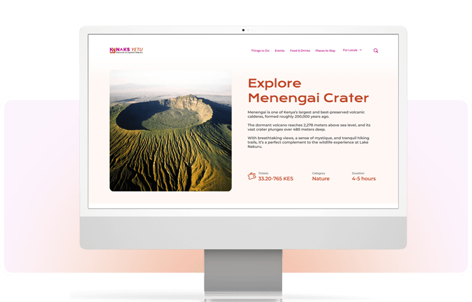
Completely redesigned platform.

Redesign: A Necessary Shift
After reviewing test recordings and user reflections, it became clear that the issues were foundational, not just cosmetic. From homepage clarity to basic task completion, the problems users faced were consistent and significant.
From the post study test users said that:

Looking back
We delivered a research-backed redesign and a testing foundation the team is now using to validate future products. The recommendations were adopted; the build is ongoing.
If I picked this up again, the first thing I'd do is re-test the new homepage against the original failure — clarity was the only metric that mattered here, and we proposed the fix but didn't get to confirm it moved 6-of-7 in the right direction. Designing the solution was the easy part. Proving it worked is the part I'd want back.


